No doubt most of us can agree that color is a key component of logo design. Choosing the right color scheme could perhaps make a huge difference in the ultimate appearance of your design, but how do you know which colors to choose when you create your own logo? Well, color harmony is a major factor for you to consider, and this quick introduction will make it easy to understand.
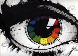
First There Was the Color Wheel
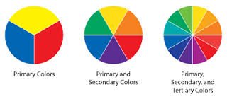
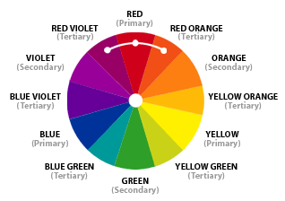
While a multitude of variations exist today, Sir Isaac Newton created the first circular diagram of colors in 1666. In traditional color theory, there are three categories of color based on the color wheel. First, the wheel is broken into the primary colors. These are the colors or pigments from which all other colors are derived. There are three primary colors, red, blue, and yellow. The next category is secondary colors, which are formed by mixing the primary colors. These colors are green, orange, and purple. Tertiary Colors comprise the final category, and these are formed by mixing a primary and a secondary color, giving the color a two word name such as yellow-orange and blue-green.
What Is Color Harmony?
The human brain seeks a visually balanced experience. If an image is visually boring, the viewer will not be engaged, and the design, along with the brand it represents, will be forgotten. However, if an image is chaotic, the viewer may not be able to understand it, and it too will be dismissed. Our visual experiences need to have a logical structure in order for us to understand them. Color harmony provides that structure. Harmony itself is simply a pleasing arrangement of different things. Thus, color harmony is easily defined as the combining of colors in order to produce a pleasing effect.
There are many theories for color harmony, but these two basic ideas are probably the easiest.
**Complementary Colors: Any two colors that are directly opposite from each other on a tertiary (12 part) color wheel.
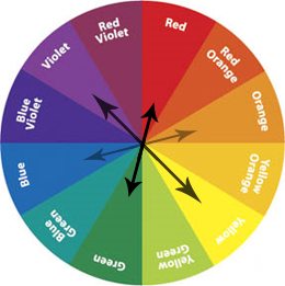
**Analogous Colors: Any three colors that are next to each other on a tertiary (12 part) color wheel. One of these three is usually the dominant color in a color scheme.
Now that you know the basics of color theory and how to begin to incorporate a harmonious color scheme into your logo design, all you need is some good design inspiration to help you create your own logo. When I need inspiration, I find that nature, perhaps the ultimate designer, is a great place to look for an incredible color scheme.