Cirque Du Soleil has its humble roots in street performance – in fact, a group of 20 started the whole thing in 1984, a number that has since grown to over 1,300 performers that put on shows across the globe. In fact, at the time of writing this article in early December of 2017, 22 shows are going on in different countries.
A logo update for this whimsical performance group has been a long time coming, and let’s take a gander at the elements of at they’ve done.
Design Principles
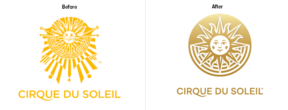
I want to point out that while the original logo is obviously lovingly-made, it’s also nightmare fuel.
![]()
In the black and white icon, we can see just how creepy the sun is. He’s even sort of looking to the side like he’s waiting for some little tasty children to walk by so he can eat them. Is that just me?
Anyway, while the icon is whimsical in a nightmare-ish way, the new Cirque Du Soliel icon manages to capture that same whimsy without the creepy. I think that’s an excellent place to start. Visually, the new icon flows well. It’s easy to follow the lines as they connect underneath the sun, and the light shadow in the background comes across beautifully without being overpowering.
The color choice is also dead on – the goldish-orange is often associated with friendliness and warmth, which makes sense since CDS literally uses a sun as its mascot. It also indicates movement and flow, which is an excellent choice for a group of artistic performers.
Overall, the color is much better than the original.
Functionality
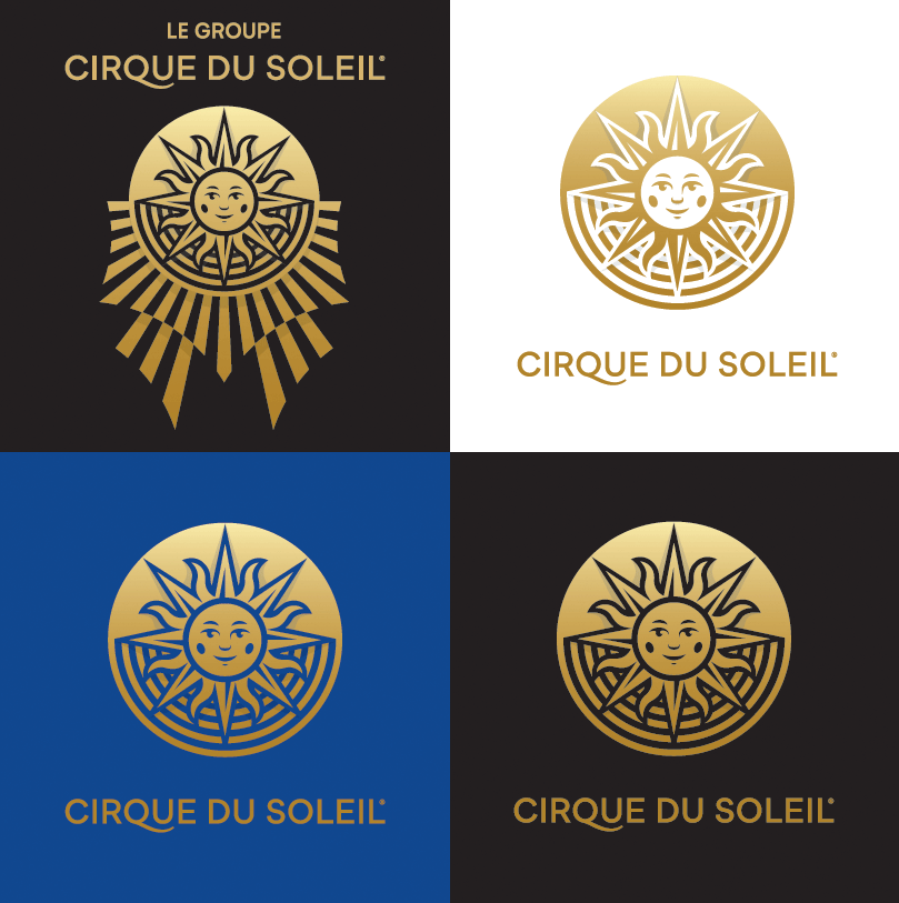
The new Cirque Du Soleil logo is much more functional than the last – it is easier to digitize, it comes off more warmly, and the design is much more simple, but still elegant. The simplicity is great for colored backgrounds, too.
Does the Cirque Du Soleil Logo Work for Its Audience?
Considering Cirque Du Soliel translates to “Circus of the Sun,” and people really only expect a sun, I’m going to go ahead and say yes. Being such a creative, strange group means that your logo can be strange too, but the new logo manages to channel that feel without being confusing or weird. It’s inviting, really, and that’s good for a performer’s logo.
Typography
The font is an improvement over the original, with a slim feel and a stylistic Q. It’s only very slightly different from the original font, however.
Possible Improvements
Personally, we don’t feel like there could be any improvements made here. The changes from the original logo are not overwhelming, and unless you wanted to overhaul the whole thing, there aren’t a whole lot of additional improvements to be made. It’s not dramatic, but this is a great reinterpretation of the original logo.