As young children, shapes are one of the first things we are taught. We learn to see them everywhere, in everything. When we begin to draw, our first figures of animals and other people are generally a combination of shapes. A few months ago my mother came to visit, and she brought with her a bag of stuff that she had saved from my childhood. Why she thought I wanted this bag of stuff, I can’t rightly tell you, but that isn’t the point. As I pilfered through this bag of old writing and artwork, I saw quite a few animals and people made up of simple shapes. A cat’s face was an upside down triangle with two more triangles for ears. A drawing of my mother consisted of a circle for a head, attached to an upside down triangle for her dress, with a couple of lines jutting out of the bottom to indicate her legs. It was an exceptionally flattering rendering of my mom by her then three year old, which must be why she kept the picture.
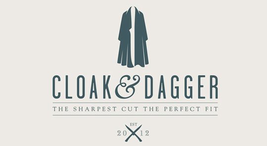
Perhaps this is one of the reasons that the use of shape and space has become such an effective psychological tool in logo design. Characteristics of shape within a logo design can determine the mood and overall message of that logo. Sharper, more angled shapes are perceived differently than softer, curved shapes. Have a look at the two logos below.
![]()
What feelings do these two logos evoke? What perceptions do have about these two companies based solely on their logo design choices?
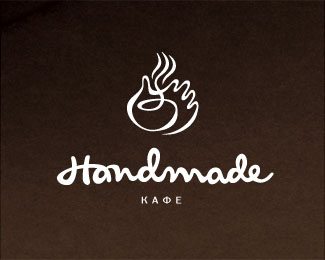
Of course shape isn’t the only factor to consider. The creative use of space in graphic design can be an exquisite element to any logo. In psychological terms, impressive utilization of “negative space” can be both memorable and efficacious for your design and the message that you want to impart. “Negative space” is simply space without content. In logo designs it can be used to form additional shapes and images or to create optical illusions. A clever mixture of great design and negative space can help you to create a superb logo. Here are some examples of logos that use negative space really well.
![]()