Good logos are like good men (or women): they’re hard to find. That doesn’t mean that you can’t scrap the one you have and start from scratch. Good logo design principals are basic. Once you learn them, creating a good design with the help of your graphic designer is simple.
Your Logo is Cluttered
If your logo isn’t working, it’s probably too cluttered. A clean logo design is important, no matter what industry you’re in. To create a clean logo, keep the design symmetrical and only apply a few design elements. Software companies seem to follow this principle incredibly well. Apple has their iconic apple, HP uses a simple blue square near their name, and Microsoft has four blocks of color that appear to be waving in the wind.
You Don’t Use an Original Font
Your logo’s font can easily tie all of your marketing materials together. As a business, you spell out your name dozens of times per day. Why not do it in an original way? This isn’t something your should attempt yourself, though. A good graphic designer can come up with a font that matches the feel of your company.
For example, take a look at the Coca-Cola logo. It uses only two colors, a distinctive font and a line. Some start-up businesses would think that a logo this simple isn’t distinctive enough, but without looking up Coca-Cola, you can probably picture the logo. That is because the font is so distinctive.
The Sharpie logo is another example of a font used well. Since the logo is simply the brand name, the font must be impeccable. Sharpie chose a font that brings to mind free-flowing script, which is what their brand espouses.
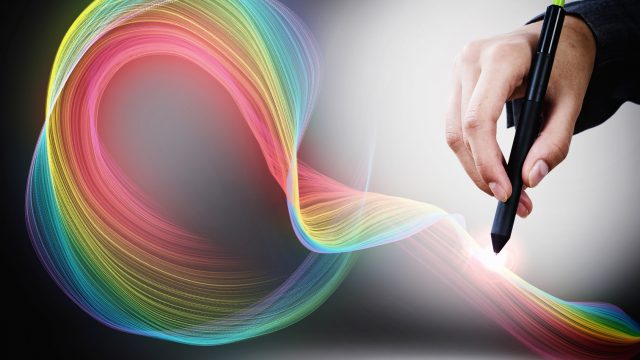
You Don’t Use Color
If your logo is black and white, you’re missing out on a design detail that could make your logo more memorable. Choosing the right colors will make your logo easier to remember.
For example, when you think of Pepsi, you probably remember the red, white, and blue circle on their products. Without even seeing the name, you automatically connect the logo with the product. This is because colors evoke emotion.
Sixty-two to ninety percent of a person’s judgment about a product comes from the color, according to a study by the University of Winnipeg, so your product’s logo colors must convey the right message.
Colors mean different things to different people, but in general, these six points are important to remember when designing a logo:
*Red, white, and blue are patriotic colors when used together.
*Red is often used in conjunction with food because it induces hunger. It is also the color of love or passion.
*Blue is a calming, refreshing color.
*Orange is energetic.
*Men don’t like purple very much, but women do.
*Pink is often identified with being feminine and youthful.
Logos aren’t a mystery. When simplicity is combined with the right font and the perfect color, a memorable logo can come to fruition.