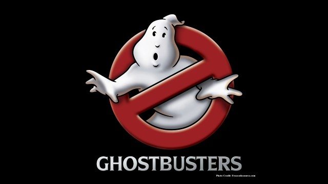
Ghostbusters—the classic 1984 comedy starring Bill Murray, Dan Aykroyd, and Sigourney Weaver—not only delivered terrific humor about the potentially terrifying subject of ghosts, it also delivered a hugely popular logo.
Michael C. Gross, an associate producer on the film and former partner in the graphic design firm Pellegrini Kaestle and Gross designed the “no ghost” logo, loosely inspired by the universal prohibition sign, an international safety symbol created by the International Organization for Standardization. The movie’s logo uses a mirror image of the symbol, with the diagonal red line running from top right to bottom left of the red circle. Inside the circle, of course, is the startled cartoonish white ghost.
The logo was cleverly used on the movie poster as the “o” in Ghostbusters. But one curious thing about the Ghostbusters logo is that it 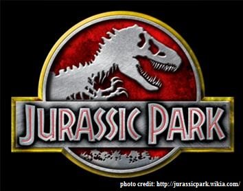 not only lived on a variety of promotional materials for the movie, it also lived inside the movie itself as the logo for the ghost hunting and trapping business at the center of the story. Another well-known case of referring to the internal world of the film with a logo—known in filmmaking lingo as diegesis—is Jurassic Park where the movie logo also serves as the logo for the theme park within the film.
The Ghostbusters logo proved so popular that variations of it were used in a variety of real-life scenarios, including the political campaigns of 1984. 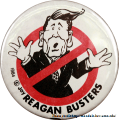 “Reagan Busters” buttons and t-shirts were circulated to promote Reagan’s opponent. The spin-off stayed true to the Ghostbusters logo by retaining the diagonal red line running from top right to bottom left; the caricature of a startled Ronald Reagan appeared trapped inside. Republicans shot back with their own “Fritz Busters” buttons, showing the Democratic Party’s 1984 presidential candidate inside of the symbol.
The existence of those copycats at the level of presidential politics is a testament to the power of the Ghostbusters logo. Its notable simplicity makes it highly memorable, and it immediately and effectively engages its audience through the use of bold contrasting colors and a spirited graphic personality. Actor Dan Aykroyd recently confirmed that there is a third Ghostbusters movie in the making; the positive feelings roused by the logo have certainly played a major part in the movie’s long-lasting appeal.
-Logos in the Movies: Behind The Ghostbusters Logo