The Beatles, AC/DC, Nirvana, and The Grateful Dead, among others, are outstanding rock and roll bands with memorable logos to match. But the Rolling Stones have arguably the most powerful logo that has stood the test of time. The British band’s lips and tongue logo is “one of the world’s most instantly recognizable symbols of rock and roll,” according to London’s Victoria and Albert Museum of decorative arts and design. David Barrie, director of The Art Fund, the U.K.’s preeminent art charity, calls it “one of the most visually dynamic and innovative logos ever created.” The design was voted the greatest band logo of all time in an online poll conducted by Gigwise in 2008.
The pop art-style logo was designed by John Pasche in 1970 and has remained in place without modification ever since. At the time Pasche took the reins, the band had grown disappointed by the concepts presented by their record label, Decca Records. So in 1969, lead singer Mick Jagger asked the Royal College of Art in London to help him find a design student to create images for the band. Jagger visited Pasche’s degree show at the college and was very impressed. This led to conversations between Jagger and Pasche about a logo and other potential work for the band’s own label, Rolling Stones Records, inaugurated after the group’s contract ended with Decca in 1970. The lips and tongue logo first appeared on the inner sleeve of the band’s 1971 album Sticky Fingers.
Pasche’s inspiration for the design is rooted in those early encounters with Jagger. In a Rolling Stone magazine article, Pasche explained, “Face to face with him, the first thing you were aware of was the size of his lips and his mouth.” But the logo—after attaining global recognition and building a storied history over the decades—has become synonymous with youth, musical rebellion, and an anti-establishment attitude, making it more of a cultural movement than a static design.
And the lips and tongue logo most certainly lives on. Just last year, the Rolling Stones celebrated their 50th anniversary, and the band 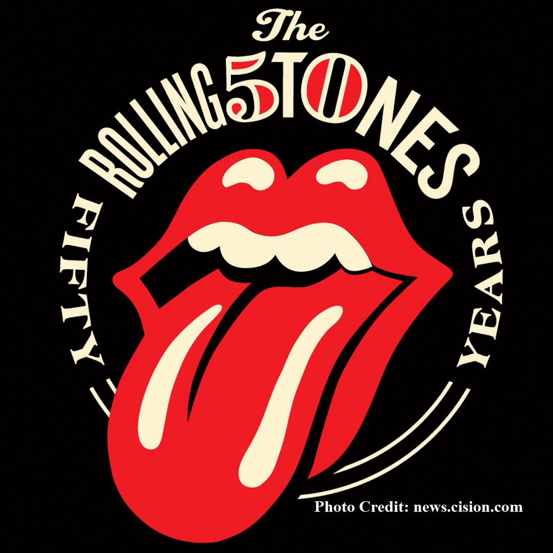 tapped graphic designer, Shepard Fairey, who created Obama’s “HOPE” portrait. The commemorative 50th anniversary logo is a celebration of the original. As Fairey notes on his website: “One of the first things I asked Mick was, ‘don’t you think the tongue HAS to be included?’ He responded, ‘yeah I guess it ought to be.’ Case closed. I was very humbled and honored to be asked to work on the 50th anniversary logo so my objective was to service and showcase the Stones’ legacy rather than try to make my contribution dominant.” This is just another chapter in the annals of one of the most enduring, timeless images in the design history of rock and roll.
– Rock and Roll Design History: The Rolling Stones Logo