
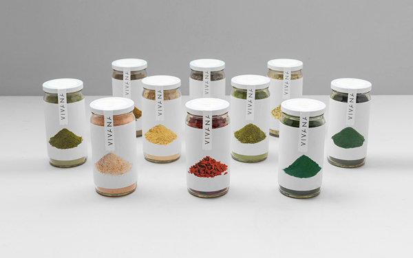
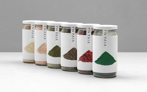
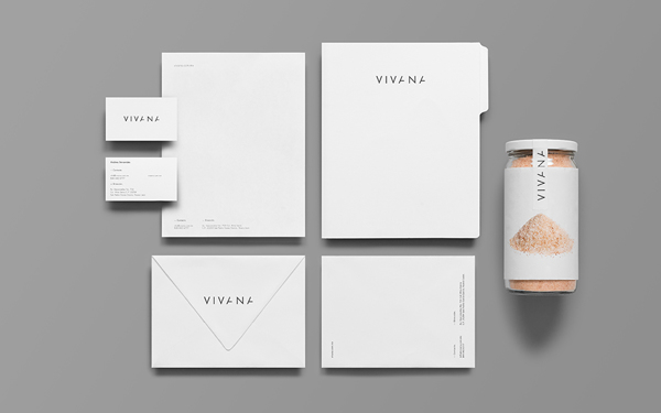
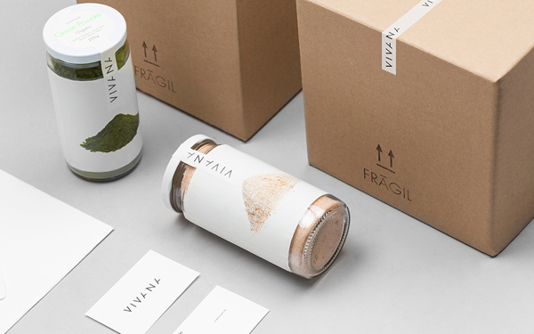
Designed by Anagrama in Mexico, Viviana is a brand of highly nutritious food products made with natural ingredients. Located in Monterrey, Mexico, the brand name is derived from the Spanish words “vivir”, meaning “to live”, and “vida”, meaning “life”. The brand name is intended to convey the product line’s natural, purifying, life-giving properties.
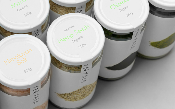
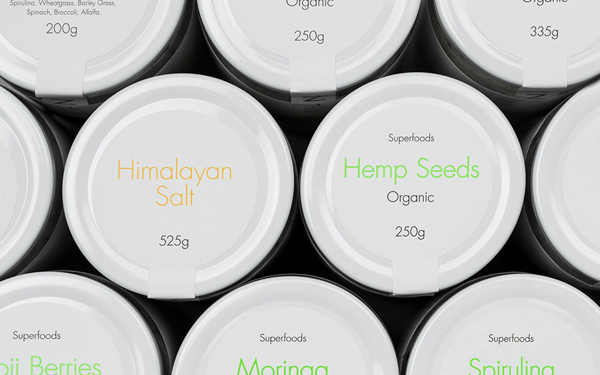
According to the designers, “Honesty, one of the main values that the brand represents, is the main reason we decided to maintain the consistently simple and concrete graphic language in the logotype and packaging. The main reason we decided to use product images on the packaging was the need to make sure one of the main product traits, being pure and trustable, was communicated effectively. In addition to this, we located the product description on the upper part of the packaging making it easier to be read through the opening process for it’s consumption.”
The typeface utilized in the name is edgy enough to be on trend this year. The simplicity of the rest of the packaging design is sweet, and it nicely references the elements of the brand identity that the designers want to emphasize. I dig it. I think these products would jump out at me from the chaotic sea of marketing madness if I saw them in my store aisles. What do you think? Is Vivana just simple enough? Is it too simple?
To see more from Anagrama, you can click here: http://www.anagrama.com/


