1. Keep It Simple
For a really cool logo design, more is definitely not better. Simplicity is a valuable asset for a logo. Complex designs might seem cool, but they are not nearly as manageable as a simple design is because they aren’t as versatile and they are generally more expensive to reproduce. Furthermore, you might think that a complex logo design will stand out, making your brand more memorable. However, this isn’t necessarily true. Our brains actually appreciate simple designs because we can process them more easily, which makes them easier to understand. If an image is too complex, our brains are more likely to just dismiss it, so a simple log design can really be more memorable. Having a simple logo doesn’t mean your logo has to be boring. Check out these logos below. They are simple but still creative and definitely cool.

2. Rethink Ordinary Shapes
Your logo should be appropriate to your business, and many logo designs incorporate images that indicate the type of business that represent. For instance, a church might use a cross in its logo design, a construction company might use tools for its logo, and realty company might use keys for its design. The only problem with using images that are business specific like this is that it has been done so much already. you don’t want your logo to be like all of the other logos in your field. What would be cool about that? However, you can still use shapes and illustrations without being cliché. To use industry relevant shapes in your logo design and to still have a really cool logo, you just need to be creative with how you use the shape within your design. Check out these totally cool logos below. They all use shapes that are indicative of their businesses, but they have all put creative twists on how the shapes are utilized.


![]()
3. Use Negative Space
Using negative space is one my personal favorites for creating cool logos. Sometimes referred to as “white space”, “negative space” is simply space without content. For graphic designs like logos, negative space can be used to create additional images within images or to create optical illusions. By combining simple shapes and using negative space, you can transform a mundane design into an incredibly cool logo. Check out these logos below, all of which utilize negative space beautifully.


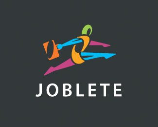
4. Play With Color
Don’t be afraid to use color. Of course, you don’t want to go crazy and use too many colors, then your logo will just look like it was attacked by an angry mob of crayons. That might be cool if you’re five, but the majority of the consumer population might disagree. Pick a few colors that you love, that you feel help express the vibe of your business. Use a classic or vintage design idea and add contemporary colors to make it cool and unique, or use traditional colors but incorporate modern shapes to achieve a cool effect. There are a lot of ways too use color in your logo design. Check out these really cool, colorful logos below.
![]()
 5. Hire a Cool Graphic Designer
Find a really cool graphic designer. A professional designer can do all of this for you. If you like the personality of a designer, his or her personal style, and his or her approach to design, then the chances are you probably love the designs that he or she creates for you. Hiring a professional is always a good idea. You will get the cool logo that you want without the hassle of trying to figure out what’s cool.